No Products in the Cart


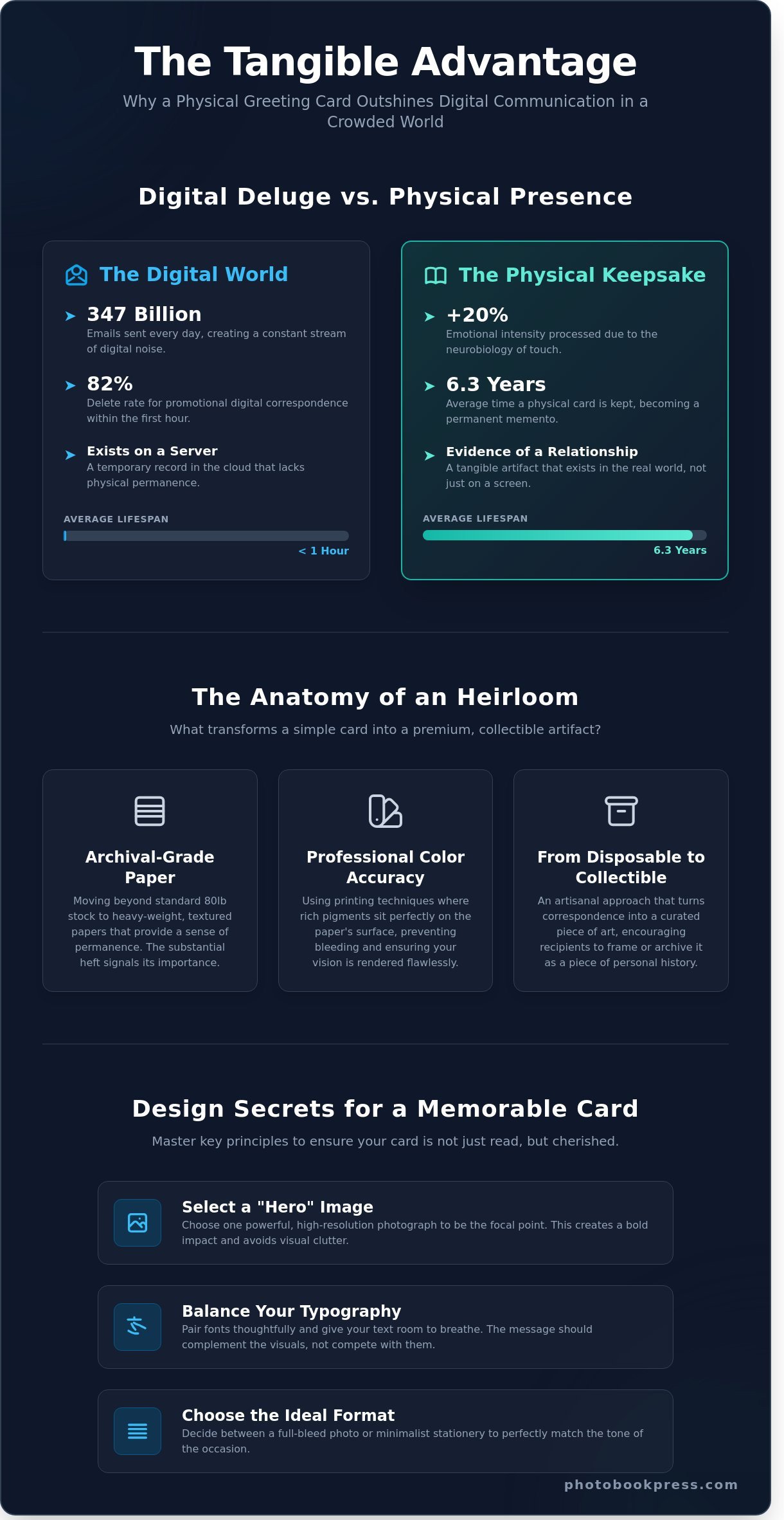
In a world where 347 billion emails are sent every single day, why does a single envelope in your mailbox still have the power to stop time? You likely agree that a digital notification can't replicate the tactile weight of premium paper or the depth of a perfectly rendered photograph. Most of us have felt the frustration of receiving a flimsy, pixelated card that fails to honor the moment it was meant to celebrate. When you choose to send greeting cards, you're offering more than just a message; you're sharing an exquisite artifact of your personal history.
We promise to show you how to transform your correspondence into an archival-quality heirloom that recipients will keep as a permanent memento. By focusing on professional-grade color accuracy and the sophisticated textures of heavy-weight stocks, you'll ensure your creative vision is never lost in the mail. This guide explores the intersection of meticulous craftsmanship and modern design to help you create a high-end product that tells your story, beautifully told.
Digital notifications provide a temporary chemical spike, but they lack the staying power of a physical object. In our current climate, the act of opening a mailbox to find a hand-addressed envelope provides a rare moment of stillness. This is the resurgence of the "slow communication" movement. Physical greeting cards act as a permanent anchor for a temporary moment, capturing a specific date and feeling in a way that a social media post never could. We're moving away from the friction-less ease of a text message toward the deliberate weight of paper. This shift isn't just about nostalgia; it's about the neurobiology of touch. When you hold a textured card, your brain processes the sentiment with 20% more emotional intensity than a digital counterpart.
This tactile tradition has deep roots that anchor our modern preferences. Exploring the history of greeting cards reveals that while the medium has transitioned from ancient papyrus to woodblocks and eventually to digital presses, the human need for a physical exchange of goodwill remains constant. Today, we treat these objects as curated artifacts of our personal history. They aren't just paper; they're evidence of a relationship that exists in the real world rather than just on a server.
To better understand the creative process behind these physical keepsakes, watch this helpful guide:
By 2026, the average professional receives 120 emails daily. The "delete" rate for promotional or casual digital correspondence sits at a staggering 82% within the first hour of receipt. In contrast, a physical card is often kept for an average of 6.3 years. The sensory experience of unboxing a high-quality envelope creates a lasting memory. It's the difference between a fleeting whisper and a permanent record. These greeting cards build a legacy, forming a tangible timeline of a family's history that digital cloud storage simply cannot replicate. The weight of the cardstock and the smell of the ink serve as sensory triggers that strengthen the emotional bond between the sender and the recipient.
The modern consumer has shifted from "sending a note" to "sharing a story." We no longer view a card as a mere delivery mechanism for a message; it's a curated piece of art. Many recipients now treat high-end cards as wall art or keepsakes, placing them in frames or archival boxes. At PhotoBook Press, we've honored the 1985 heritage of the printing craft for decades. We ensure every piece feels like an heirloom. This artisanal approach transforms a simple gesture into a collectible artifact. When you choose a card with archival-quality materials, you aren't just celebrating a birthday or an anniversary. You're investing in a piece of personal history that will survive for generations, long after the latest smartphone app has become obsolete.
True luxury begins with the weight of the card in your hand. While a standard 80lb cover stock provides a functional base for mass-market products, archival-grade stocks offer a density that signals permanence. These materials aren't just paper; they're the foundation of a legacy. When you hold a card with substantial heft, you feel the difference immediately. It isn't just about thickness. It's about the interplay between the ink and the fibers. High-end stocks allow the pigment to sit perfectly on the surface, maintaining a richness that cheaper alternatives lose through bleeding or oversaturation.
The desire for tangible keepsakes isn't a modern invention. It's a tradition that stretches back to the classic American travel postcards of the early 20th century, which helped define how we share our personal histories. Today, premium greeting cards carry that same weight of cultural connection, transforming a simple message into a tactile experience that recipients want to display rather than discard. The way the paper absorbs ink determines the final 'feel' of the image, ensuring that the colors don't just sit on the page but become part of the material itself.
Choosing a finish is a stylistic decision that dictates the mood of your message. A glossy finish provides a high-contrast, vibrant look that mimics traditional photo prints, making it ideal for sharp, colorful landscapes. Matte finishes offer a sophisticated, glare-free surface that's easier to read under direct light. For those seeking a unique sensory experience, the tactile appeal of eggshell, linen, or smooth textures adds a layer of depth. These finishes invite the recipient to touch the card, creating a connection that digital screens can't replicate. Choosing archival-quality materials ensures these textures remain intact for decades.
Resolution is non-negotiable in high-end printing. We print at 300 DPI to ensure every line is crisp and every detail is visible, ensuring every custom greeting card is a masterpiece of clarity. While your screen displays images in RGB, our presses translate those colors into CMYK with meticulous calibration. This process ensures the physical card matches your digital vision with 99% color accuracy. Archival-quality refers to the specific use of acid-free paper and pigment-based inks that prevent yellowing and fading over time. You can see this dedication to longevity when you explore our bespoke card collections.
The envelope is the prologue to your story. If the card is premium but the envelope is thin, the spell is broken. A 100lb text-weight envelope provides a sense of anticipation. It protects the contents during transit and signals that something valuable is inside. We treat the envelope with the same reverence as the card itself, ensuring the paper grain and color tone are perfectly matched. This holistic approach to craftsmanship ensures that your memories are preserved with the respect they deserve, from the moment they're pulled from the mailbox to the years they spend tucked away in a keepsake box.
The choice between a full-bleed photographic layout and a minimalist typographic design defines the card's emotional weight. A full-bleed image, printed on 120lb archival cardstock, transforms a simple message into a curated artifact. It demands immediate attention. Minimalist designs, by contrast, utilize white space to highlight the texture of the paper and the precision of the ink. This choice depends entirely on the narrative you wish to share. Bold, vibrant colors suit celebratory milestones like a 50th anniversary. Understated elegance, perhaps a simple foil-stamped monogram, serves better for formal gratitude or professional networking.
Flat cards have gained popularity for their modern, gallery-like feel. They're efficient and direct. Folding cards offer a more traditional experience, hiding the personal message until the recipient physically opens the gate of the card. This sequence of reveal adds a layer of intimacy to your greeting cards. Research from the University of Limerick explores the psychology of sending cards, noting that the physical act of giving creates a lasting emotional bond that digital messages cannot replicate. For the professional photographer, the back of the card is prime real estate. A small, centered logo and a subtle website URL turn every piece of mail into a sophisticated marketing tool without detracting from the art.
Professional photographers often use 7x5 inch photo cards as a tactile sneak peek for clients awaiting their full wedding albums. These cards act as high-fidelity proofs of the craftsmanship to come. Design layouts should prioritize the image, allowing the composition to breathe without the intrusion of cluttered text. A 10x7 inch panoramic spread, when unfolded, creates a cinematic experience that honors the scale of a landscape or a wide-angle ceremony shot. It's a miniature exhibition delivered directly to a mailbox.
Every professional benefits from a cohesive brand identity that extends beyond the digital screen. A set of high-end custom notebooks paired with matching stationery signals a commitment to quality and detail. In the corporate world, the etiquette of the handwritten note remains a powerful differentiator. While 81% of business communication is now digital, a physical card on premium 350gsm paper commands respect. These pieces merge modern, clean aesthetics with the heavy, tactile traditions of classic printing, ensuring your greeting cards leave a legacy of professional excellence.
Creating a physical keepsake requires a transition from the digital screen to the tactile world. Professional designers treat greeting cards as miniature galleries, where every millimeter of space serves a purpose. The goal isn't just to share a message; it's to provide an archival-quality experience that the recipient feels compelled to display on a mantel or keep in a legacy box. Achieving this level of sophistication depends on a meticulous balance of visual weight and technical precision.
The "hero" image carries 75% of the visual impact on the front cover. When selecting your photograph, look for a clear focal point that follows the rule of thirds, as placing your subject off-center creates a more dynamic and professional composition. Because ink on paper absorbs light differently than a backlit screen, you should typically increase your photo's brightness by 10% and boost the contrast slightly to ensure the print doesn't appear muddy or flat. When you design photo cards featuring a collage, maintain a cohesive story by using images with similar lighting or a shared color palette to avoid a cluttered aesthetic.
Typography is the voice of your card. For an exquisite, high-end look, pair a timeless serif font for your main headings with a clean sans-serif for the smaller details. This contrast creates a hierarchy that guides the eye naturally through the design. Always place your text in "quiet" areas of the photo, such as a clear sky or a blurred background, to ensure legibility without obscuring faces or critical details. Maintaining a minimum resolution of 300 DPI ensures that every pixel translates into a sharp, crisp detail on paper, preventing the blurred edges that compromise a professional finish.
Beyond the imagery and text, the use of white space defines the luxury of the final product. Leaving a generous margin of at least 0.25 inches around the edges creates a "gallery-curated" feel that signals intentionality. This breathing room prevents the design from feeling cramped and draws the viewer’s focus directly to the heart of the card. Color coordination is equally vital; pulling a specific hex code from a dominant element in your photo, like the soft gold of a sunset or the deep green of a forest, and using it for your font color creates a seamless, handcrafted harmony.
The final proofing stage is where the most critical errors are caught. Statistics show that 15% of custom print orders contain a spelling error or a date mistake that wasn't visible during the initial creative rush. Check your "bleed" areas carefully. Ensure all essential elements are at least 0.125 inches away from the trim line to avoid accidental cropping during the cutting process. Verify that your images aren't just beautiful, but also technically sound for the specific paper weight you've chosen, as textured stocks can soften fine lines more than high-gloss finishes.
Your memories deserve a presentation that reflects their value. By applying these professional standards, your greeting cards transform from simple notes into exquisite artifacts of personal history. Take the time to refine every detail, from the curve of a serif to the depth of a shadow, ensuring your story is told with the grace it deserves.
Ready to transform your favorite moments into a tangible legacy? Start crafting your custom cards today and experience the difference of artisanal print quality.
Choosing a medium for your most cherished messages requires a partner that understands the weight of a legacy. Photobook Press has spent decades perfecting the intersection of industrial precision and hand-finished artistry. At our 15,000-square-foot Maryland production facility, we maintain a rigorous standard where every piece of mail is treated as a potential heirloom. We don't just "run jobs"; we curate individual stories through a workflow that balances high-end digital technology with the careful eye of a master binder who inspects each fold. This commitment ensures that every customer receives professional-grade quality that was once reserved only for high-end gallery catalogs and museum monographs.
Professional photographers and creative agencies often seek ways to bridge the gap between digital delivery and physical keepsakes. Our wholesale program provides a streamlined solution for client fulfillment, allowing pros to offer premium greeting cards that match the caliber of their photography. Data from industry surveys suggests that clients who receive physical prints are 35% more likely to book repeat sessions. By utilizing our Maryland-based fulfillment, photographers can scale their business without sacrificing the boutique feel their brand demands. It's a logical step to move from a set of thank you cards to full-scale heirloom albums as your client's story grows over the years.
Our history began in 1985, and that nearly 40-year heritage informs every technical decision we make today. We've sourced premium, FSC-certified papers and archival inks that resist fading for over 100 years under standard lighting conditions. Sustainability isn't a buzzword for us; it's a core component of our Maryland-based production where we minimize waste through precision-cut technology. We believe that "Your story, beautifully told" is a promise that starts with the raw materials. Each card is inspected by hand to ensure the color precision meets our 98% accuracy threshold, providing a tactile experience that digital screens simply cannot replicate.
Our design interface is built to serve both the weekend hobbyist and the seasoned professional designer. You'll find intuitive tools that allow for pixel-perfect placement of your imagery. Once your design is finalized, our global shipping network reaches over 50 countries, ensuring your connections remain strong regardless of distance. Whether you're sending a single note or a thousand greeting cards for a corporate event, the process remains seamless. Design your custom greeting cards with Photobook Press today and begin the journey of preserving your most meaningful moments in print.
A physical message holds a weight that digital notifications simply can't replicate. By choosing archival-quality materials and applying professional design principles, you turn a simple note into a preserved memory. Since 1985, our Maryland workshop has focused on the meticulous craftsmanship required to produce stationery that stands the test of time. These aren't just greeting cards; they're small, handcrafted legacies designed to be felt as much as they're read. You now understand how the right textures and layout secrets can elevate a standard photo into a gallery-worthy keepsake.
Professional photographers can access specialized discounts to help share their work with the world through our premium press. Every piece we create uses the same rigorous standards we've maintained for 39 years. It's time to move your best moments off the hard drive and into the hands of those you love. Your recipients will appreciate the deliberate choice of premium paper and the clarity of professional-grade printing. Experience the quiet confidence that comes from sending a message that's built to last. We look forward to helping you share your vision with the world.
Design your bespoke greeting cards at Photobook Press and begin the journey of telling your story with grace and permanence.
A premium greeting card requires a substantial weight, typically a 100lb or 130lb cover stock. This thickness provides a tactile sense of luxury and ensures your card stands upright without bowing. At PhotoBook Press, we utilize archival-quality 110lb Mohawk Superfine paper to achieve a refined finish. This specific weight balances durability with a smooth, matte texture that highlights every detail of your imagery.
You can certainly order bespoke stationery in bulk to showcase your professional portfolio. We offer tiered pricing for orders exceeding 50 units, allowing photographers to maintain a consistent brand identity. By ordering 100 or 500 units at once, you reduce the per-unit cost while securing a high-end marketing tool. These handcrafted items serve as a physical extension of your artistic vision for every client interaction.
A flat card consists of a single two-sided sheet, while a folded card features a central score that creates four distinct panels. Flat cards often serve as elegant 5x7 announcements or invitations. Folded greeting cards provide more space for personal narratives and traditional sentiments. Choosing between them depends on whether you prefer a minimalist, modern aesthetic or a classic, multi-page storytelling format.
To ensure color precision, calibrate your monitor to a 6500K color temperature and use the sRGB color profile. Screens emit light while paper reflects it, so we recommend a brightness setting of 120 candelas per square meter. Our master printers use calibrated HP Indigo presses to match your digital files with 98% accuracy. This technical rigor ensures that the deep hues in your photography translate perfectly to the final print.
Every order of our printed products includes complimentary, premium white envelopes designed to fit your chosen dimensions. These 80lb text-weight envelopes provide a sophisticated first impression for your recipients. For those seeking extra distinction, we offer optional eggshell or kraft paper upgrades. This ensures your handcrafted message is protected and presented with the same care we give to the printing process itself.
The standard sizes for our custom pieces are 5x7 inches and 4.25x5.5 inches, also known as A7 and A2 formats. The 5x7 size is our most popular choice, accounting for 75% of all holiday and wedding orders. These dimensions provide ample room for high-resolution imagery and elegant typography. Selecting a standard size also ensures compatibility with a wide range of mailing services and frame options.
You can easily add your business logo or a personal signature to the back panel of any card. Our design interface allows you to upload a 300 DPI transparent PNG or JPEG file for a professional finish. This feature is essential for artists who want to maintain brand recognition on their 100% custom stationery. It transforms a simple card into a branded artifact that carries your unique mark of quality.
Production typically takes 3 to 5 business days, followed by your selected shipping method. We offer expedited 2-day shipping for time-sensitive projects. Each order undergoes a manual quality check by our artisans before it leaves the press. This meticulous timeline ensures that your memories are handled with the respect they deserve, arriving at your door within 7 to 10 total days. Your story, beautifully told.