No Products in the Cart


If every digital server vanished tomorrow, what physical evidence would remain of the life you've built? We live in an era where 1.8 trillion images are captured annually, yet the vast majority exist only as temporary pulses of light on a screen. You likely feel the weight of this digital clutter and crave something more substantial. Choosing to invest in professional photo prints isn't merely a home decor decision; it's an act of preservation that ensures your most meaningful moments don't dissolve into obsolete file formats.
You deserve a physical legacy that feels like a handcrafted heirloom rather than a fleeting notification. This guide reveals how to elevate your personal gallery into a collection of museum-grade artifacts designed to remain vibrant for over 200 years. We'll demystify the subtle differences between matte, glossy, and lustre finishes to ensure your vision is perfectly translated to paper. You'll also gain expert clarity on archival standards and the precise file preparation techniques required for breathtaking color accuracy. We're here to help you turn your digital history into a curated collection of exquisite art.
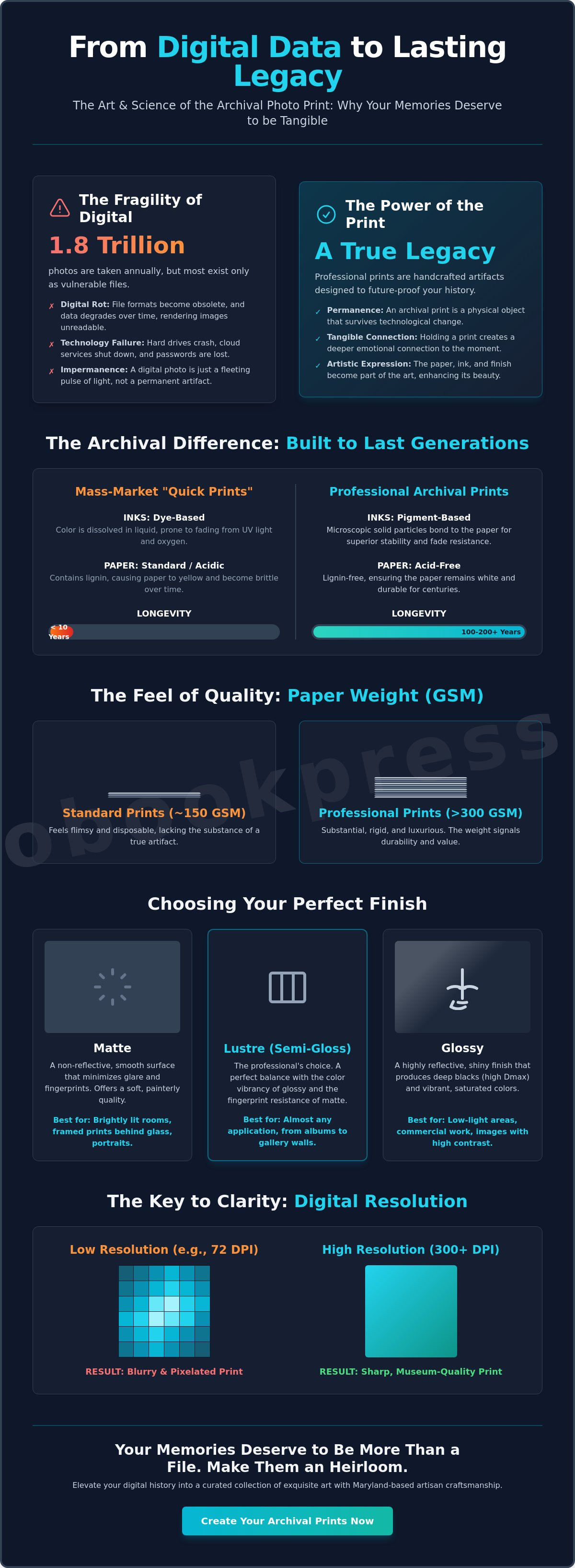
A professional photo print represents a precise marriage between high-resolution digital data and archival-grade physical materials. It isn't merely a reproduction of a file; it's a handcrafted artifact designed to survive the limitations of screen-based media. While many people rely on cloud storage, digital files are inherently fragile. They often suffer from digital rot, a process where bit-decay or evolving software formats render images unreadable within a few decades. Physical photo prints offer a permanent bridge to the past, serving as the only true method to future-proof your history against the obsolescence of technology.
When exploring the history of photographic printing, it's clear that the transition from darkroom chemistry to modern inkjet precision hasn't changed the fundamental desire for a permanent record. By choosing professional photo printing services, you move beyond the flat, often inaccurate colors of mass-market labs. These artisan services provide a level of color depth and tonal range that mimics the original scene with startling accuracy. This process transforms a fleeting digital moment into a curated legacy, allowing you to build a collection of physical artifacts that tell your story with quiet confidence and grace.
To better understand the nuances of creating high-quality physical versions of your images, watch this helpful video:
The longevity of a print depends entirely on its chemical composition. Mass-market "quick-print" results typically use dye-based inks, which consist of colorants dissolved in liquid. These dyes are susceptible to rapid fading when exposed to UV light or oxygen. In contrast, professional photo prints utilize pigment-based archival inks. These inks are made of microscopic solid particles that bond to the paper surface, offering superior stability and resistance to environmental shifts. This chemistry works in tandem with acid-free paper, which lacks the lignin that causes standard papers to turn yellow and brittle over time. Archival quality is a standard that ensures prints last 100+ years under gallery conditions.
The weight of a print, measured in grams per square meter (GSM), dictates its presence and perceived value. While standard drugstore prints often feel flimsy at 150 GSM, professional stocks usually exceed 300 GSM, providing a substantial, rigid feel that signals durability. The texture of these papers, whether it's a smooth matte or a fine-art baryta, interacts with ambient light to add a three-dimensional quality to the image. This interaction enhances the emotional weight of a portrait, as the shadows appear deeper and the highlights more luminous. Professional photographers select heavy-weight stocks for their portfolios because the paper itself becomes a vital component of the artistic expression, ensuring the viewer feels the substance of the memory.
Selecting the finish for your photo prints is the final, vital act of curation. At Photobook Press, we provide three distinct surfaces: Matte, Glossy, and Lustre. Each finish dictates how light interacts with the pigment, influencing the perceived depth and emotional weight of the image. The right choice is rarely objective; it depends heavily on the environment where the piece will live. A high-gloss print might look stunning in a low-light corridor, but it can become a distracting mirror in a sun-drenched gallery space.
The technical success of a print often hinges on its Dmax, which is the measure of the deepest black a paper can produce. Higher Dmax levels create a sense of three-dimensional depth, while lower levels offer a softer, more painterly transition between tones. Understanding these nuances helps transform a digital file into a physical heirloom that stands the test of time.
Glossy finishes are the traditional choice for those who want maximum impact. They offer the highest Dmax and color saturation, making them ideal for high-contrast landscapes or vibrant street photography. The downside is the surface's vulnerability; it captures fingerprints easily and reflects every light source in the room. This makes it less than ideal for large-scale wall art in bright areas.
Lustre is often called the professional standard for a reason. It offers the color "pop" of glossy paper but incorporates a subtle, pebble-like texture. This texture diffuses light and resists the natural oils from handling. It’s the definitive choice for personalized family portraits and wedding photography. It provides a sophisticated sheen that looks expensive without the distracting glare of a full gloss.
Matte paper is the quiet, sophisticated alternative for those who prefer an understated elegance. It features a completely non-reflective surface that excels in rooms with overhead spotlights or large windows. This finish is a favorite for black and white photography because it emphasizes the tonal shifts and grain of the image rather than the surface of the paper itself. It provides a tactile, fine art feel that mimics the quality of a museum-grade watercolor sheet.
Beyond the aesthetic appeal, matte surfaces are incredibly forgiving. If you're working with older family scans or lower-resolution images from the early 2000s, a matte finish can mask minor digital noise and softness. It smooths out imperfections that a glossy finish would otherwise magnify. For candid, moody shots or heritage projects, matte offers a timeless quality that feels deeply personal.
When you're ready to see your work in its best light, you can explore our professional print options to find the finish that matches your vision.
Selecting the physical dimensions of your photo prints requires a balance of spatial awareness and emotional intent. A print's size dictates how a viewer interacts with the image. Small, intimate prints invite the viewer to lean in close, creating a private moment of reflection. Conversely, large-format pieces command the room, demanding attention from several feet away. For a print displayed at eye level in a narrow hallway, an 8x10 provides clarity without overwhelming the space. In a spacious living room, a 24x36 enlargement acts as a focal point, anchoring the interior design with a personal narrative. The relationship between viewing distance and size is a technical necessity; a print meant to be held in the hand requires a higher density of detail than a piece viewed from across a gallery.
While large-scale art makes a statement, there's a growing appreciation for the "mini-print" and traditional wallet sizes. These smaller formats celebrate the tactile nature of photography. They aren't meant to dominate a wall but to be shared, touched, and kept close. Whether it's a 2x3 keepsake or a 4x4 square, these dimensions turn a digital file into a physical artifact that fits into the palm of a hand or the sleeve of a journal. This shift toward smaller, high-quality photo prints reflects a desire for more personal, manageable ways to interact with our digital archives.
The 4x6 and 5x7 formats remain the foundational elements of physical storytelling. These dimensions are the preferred choice for curated photo books and traditional tabletop frames, offering a familiar, tactile scale. When you're building a gallery wall, 8x10 and 11x14 prints serve as hero images that provide visual structure among smaller snapshots. Choosing these standard dimensions ensures your memories fit into off-the-shelf framing options. This avoids the complexity of custom orders while maintaining a polished, professional look for your home gallery.
Modern aesthetics have embraced the symmetry of square prints, with 5x5 and 8x8 sizes becoming increasingly popular. This trend mirrors the digital grids of social media, translating a contemporary visual language into a permanent, archival form. For expansive vistas or large family gatherings, panoramic formats capture the full breadth of the scene that a standard rectangle might truncate. Meanwhile, the revival of the wallet print offers a sentimental utility. These small tokens find their home in physical journals or tucked into a card, serving as portable keepsakes that bridge the gap between art and daily life.
Transitioning from a glowing digital screen to a tangible, physical medium is a transformation that requires both technical precision and an artistic eye. Many creators feel a sense of disconnect when their photo prints arrive looking dimmer or less vibrant than the image on their monitor. This discrepancy isn't a failure of the press; it's a fundamental difference in how we perceive light. Your screen projects light directly into your eyes, while a print relies on ambient light reflecting off paper and ink. Bridging this gap is the first step toward creating an heirloom that mirrors your original vision.
High-fidelity printing demands a density of information far beyond what most digital displays require for a sharp appearance. The industry standard for professional, gallery-quality results is 300 DPI (dots per inch), a threshold that ensures smooth gradients and fine textures. An 8x10 print requires a minimum image resolution of 2400 x 3000 pixels for crisp detail. If your file falls below this threshold, the resulting print may appear soft or pixelated. To check your file's resolution on a computer, right-click the image and select "Properties" or "Get Info" to view the dimensions. On most smartphones, you can simply swipe up on the image in your gallery to reveal the metadata and pixel count.
Because screens possess an internal light source, they often mask the true density of an image. A photograph that looks perfect on a backlit LED might appear muddy or dark once it's rendered in ink. You'll find better success by slightly increasing your image brightness by 10% and adding a subtle touch of contrast before uploading. This adjustment compensates for the lack of backlighting in physical paper. For color consistency, always export your work in the sRGB color space. This standard is the universal language of professional presses, ensuring the hues you've perfected on your device translate accurately to the final product.
Before you finalize your order, a brief moment of scrutiny can prevent common layout errors. Use this final review checklist to ensure your memories are preserved exactly as you intended:
The beauty of a professional print lies in its permanence and the tactile joy it brings to a home. By taking these meticulous steps during preparation, you ensure that your story is told with the clarity and brilliance it deserves.
Ready to transform your digital gallery into a collection of exquisite photo prints that stand the test of time?
The Photobook Press Photo Prints collection offers a refined approach to preserving your most significant moments. Unlike mass-produced alternatives, our prints are the result of a dedicated artisan process centered in our Maryland-based production facility. Every order undergoes a rigorous quality control protocol to ensure the final product meets the standards of a gallery curator. We've simplified the online ordering system so that hobbyists and professionals alike can navigate the selection process without friction. It's a boutique experience that treats your digital files with the reverence they deserve.
Our commitment to excellence is rooted in the belief that a photograph is a physical investment in your personal history. By choosing our professional photo prints, you're opting for a level of craftsmanship that prioritizes longevity and aesthetic precision. We utilize premium materials that stand the test of time, fulfilling our brand promise: "Your story, beautifully told." This artisan approach ensures that every detail, from the subtle gradient of a sunset to the fine texture of a bridal gown, is preserved with absolute clarity.
Creating a cohesive home gallery starts with selecting the right scale for your space. Our collection includes a diverse range of sizes, from intimate 4x6 keepsakes to 24x36 statement enlargements that serve as the focal point of a room. We use high-end photographic papers specifically chosen for their ability to maintain color fidelity and deep Dmax levels. This technical precision ensures that your photo prints exhibit rich black tones and a vibrant spectrum of colors. These large-format options are perfect for turning landscape photography or wedding portraits into lasting works of art that won't fade as the years pass.
For those seeking a more modern aesthetic, our 4x4 and 5x5 square prints offer a contemporary feel that complements minimalist or grid-based decor. These smaller, balanced formats are ideal for creating a chronological display of family milestones or travel adventures. Additionally, our wallet print sets provide a tactile way to share memories with loved ones or use as professional leave-behinds during networking events. Each variation receives the same meticulous attention to detail as our largest prints, ensuring archival quality across the board. You can transform your digital memories into archival masterpieces today by exploring our full range of professional options.
The journey from a digital screen to a tangible artifact is a deliberate act of preservation. By selecting the ideal finish and mastering file preparation, you ensure your most meaningful moments transition from fleeting pixels to permanent art. Since 1985, our Maryland-based professional printing facility has refined this delicate craft. We utilize archival-quality papers and pigment-based inks to deliver the portfolio-grade results trusted by professional photographers for over 41 years. This technical precision ensures your colors remain vibrant and your details stay sharp for a lifetime.
Selecting premium photo prints isn't just about home decoration; it's a sophisticated investment in your personal history. Whether you choose the soft depth of a matte finish or the vibrant clarity of lustre, your images deserve the meticulous care of a master printer. Every detail matters when you're curating a collection meant to span generations and tell a story that lasts. Trust your creative vision to a partner that values substance and aesthetic perfection as much as you do.
Browse the Archival Photo Prints Collection
Begin telling your story with the exquisite quality it requires. Your memories are ready to be held and cherished for years to come.
Archival photo prints utilize acid-free materials and pigment-based inks to ensure longevity, whereas standard prints rely on dye-based inks that often degrade within 15 to 20 years. These professional-grade materials prevent the yellowing and brittleness common in mass-market options. By choosing archival quality, you're investing in a legacy that remains vibrant for 100 years or more. It's the difference between a temporary snapshot and a permanent heirloom.
A lustre or matte finish is the superior choice for framing behind glass to eliminate distracting reflections. Glossy surfaces often create "Newton rings," which are oily-looking distortions caused by the paper touching the glass. Lustre provides a subtle texture that preserves color depth without the harsh glare. This ensures your photo prints remain visible from every angle in a well-lit gallery or home.
You need a minimum of 7.2 megapixels to produce a crisp 8x10 print at the industry standard of 300 dots per inch. This equates to a resolution of 2400 by 3000 pixels. While 5 megapixels might suffice for casual viewing, 12 megapixels offers the flexibility needed for meticulous cropping without sacrificing detail. High-resolution files ensure that every fine line and subtle gradient is captured with artisan precision.
You can print directly from social media, but these files are typically compressed to 1080 pixels, which limits their physical size. These low-resolution files work best for small 4x4 or 5x5 prints. For anything larger than an 8x10, we recommend using the original high-resolution file from your camera roll. This avoids the pixelation that occurs when social media platforms strip away 70 percent of the original image data.
The most effective way to preserve your photo prints is to store them in acid-free, lignin-free archival boxes kept at 65 degrees Fahrenheit. Maintaining a consistent humidity level between 30 and 40 percent prevents the growth of mold and the warping of paper fibers. Avoid basements or attics, as temperature fluctuations of even 15 degrees can accelerate the chemical breakdown of the image over time.
Your prints look darker because a smartphone screen is a light source, while a physical print only reflects the light around it. Most digital screens are calibrated to a brightness of 120 nits, which is roughly 40 percent brighter than a standard piece of paper. To correct this, we suggest lowering your monitor's brightness to 80 nits during the editing process. This creates a more accurate preview of the final physical result.
Photobook Press offers a specialized Pro Partner program designed specifically for the needs of professional photographers. This program provides tiered volume discounts and white-label shipping services to streamline your business workflow. It's a partnership that treats your clients' memories with the same meticulous care you put into capturing them. Registered professionals receive priority support to ensure every project meets gallery standards.
A professional-grade photo print has an expected lifespan of 100 years when displayed under normal home lighting conditions. According to data from the Wilhelm Imaging Research institute, these same materials can last over 200 years if kept in dark, climate-controlled storage. This durability ensures that your stories are preserved for multiple generations. It transforms a simple image into a lasting piece of family history.
