No Products in the Cart


What if the card you send today is still being held, admired, and cherished in the year 2050? In an age where billions of digital notifications vanish in seconds, the physical weight of a message hasn't ever carried more significance. You've likely felt the disappointment of ordering personalized greeting cards only to receive 80lb stock that wilts or colors that look nothing like the vibrant image on your screen. It's frustrating when a heartfelt gesture arrives looking like a mass-produced afterthought rather than a curated gift.
This guide will show you how to bridge the gap between simple stationery and archival art. You'll learn to select professional-grade materials, including 300gsm cotton papers and pigment-based inks, that transform your memories into enduring heirlooms. We'll examine the specific design principles and printing techniques that ensure your next message is one your recipient will choose to frame rather than discard.
In 2026, the act of sending a card has moved past the simple exchange of well-wishes; it's now a sophisticated extension of one's personal brand and a primary tool for memory preservation. While the history of greeting cards reveals a transition from ancient woodblock prints to mass production, the current era prioritizes the bespoke and the permanent. Digital notifications vanish in seconds, but a physical card demands attention. It carries a psychological weight that pixels can't replicate. Receiving a high-quality piece of mail triggers a sensory response that strengthens social bonds and elevates the sender’s status in the recipient’s mind.
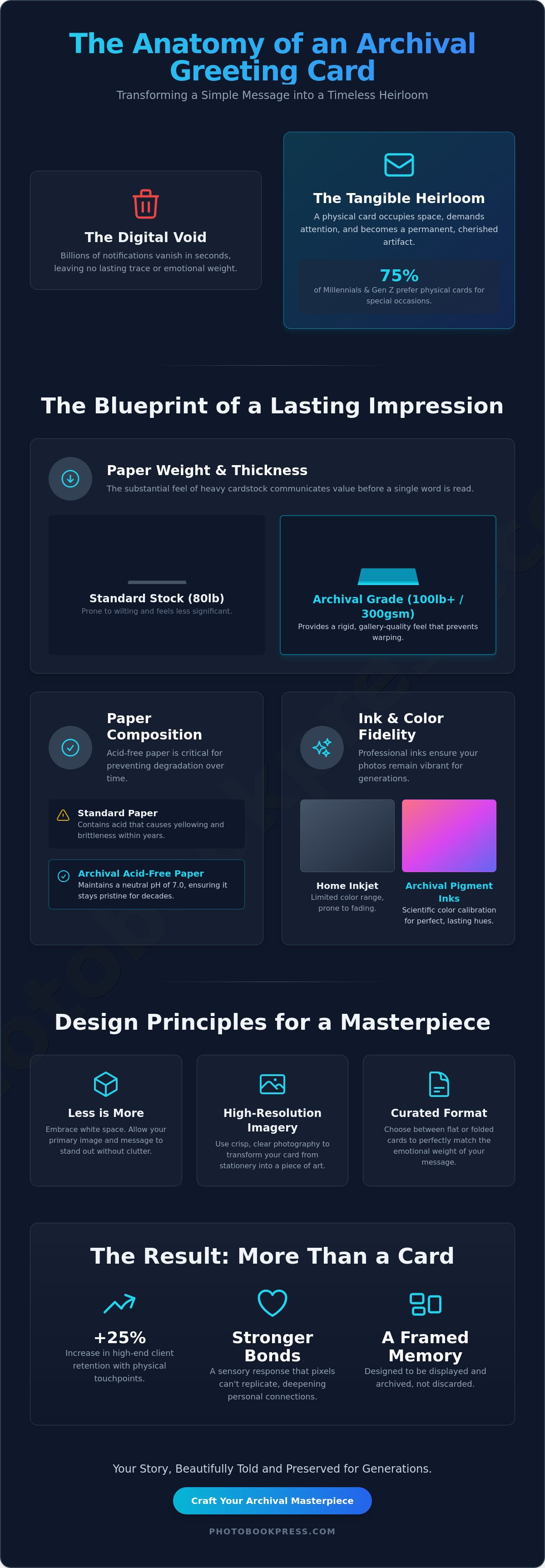
The rise of "slow correspondence" reflects a broader cultural shift toward intentionality. As digital fatigue reaches a peak, the 2024 Greeting Card Association reports indicated that 75% of millennials and Gen Z consumers prefer physical cards over digital messages for special occasions. This preference has matured into a standard for 2026. People no longer seek disposable paper. Instead, they choose personalized greeting cards crafted from archival materials that function as keepsakes. These artifacts are designed to be archived in boxes or displayed in frames, serving as tangible anchors in an increasingly ethereal world.
A physical card bridges the gap between a fleeting digital photograph and a permanent memory. It transforms a moment captured on a smartphone into a curated object that occupies physical space. In professional circles, this distinction is vital. High-end client retention rates increase by up to 25% when businesses utilize physical touchpoints rather than automated emails. For the artisan, "personalized" means more than just printing a name on a template. It involves curated intent, where the choice of imagery and layout reflects a deep understanding of the recipient’s history and aesthetic. This level of detail turns a simple greeting into a professional networking tool and a cherished heirloom.
The movement toward premium, sustainable materials is a cornerstone of modern correspondence. Discerning senders now look for FSC-certified, heavy-weight stocks, such as 300gsm or 120lb cover paper, which provide a substantial feel in the hand. The texture of the paper speaks before the first word is read. It communicates that the message was worth the weight of the medium. Using personalized greeting cards made from acid-free, archival-quality paper ensures that the ink remains vibrant and the paper doesn't yellow over the decades. Archival correspondence is the precise intersection where the utility of a message meets the enduring beauty of fine art.
A card is more than a carrier for a message; it is a physical artifact. When you hold a card crafted from 100lb cover stock, the weight alone signals its value. This thickness prevents warping and provides a rigid, gallery-quality feel that standard 60lb or 80lb papers cannot match. For personalized greeting cards intended to survive decades, this structural integrity is the first line of defense against the passage of time. The science of archival ink ensures that colors remain vibrant for decades, a hallmark of high-end personalized greeting cards that prioritize longevity over convenience.
Matte finishes offer a sophisticated, non-reflective surface that allows fine details to emerge without the distraction of glare. This is essential for black-and-white photography or minimalist designs. In contrast, eggshell textures provide a subtle tooth that elevates the tactile unboxing experience. According to data from the Greeting Card Association, the demand for high-end, sustainable materials grew by 12% in 2024. Ensuring your paper is acid-free is a requirement for a lasting legacy; acid-free stock maintains a neutral pH level of 7.0, preventing the yellowing and brittleness that plague cheaper alternatives.
The difference between a mass-produced card and a premium one lies in the "press" heritage. Professional-grade digital offset presses utilize a multi-ink process that exceeds the limited range of home inkjet printers. This precision ensures that every hue is rendered with absolute fidelity. Achieving this level of accuracy requires rigorous color calibration, matching the digital file to the physical output with scientific exactness. When exploring photo printing services, the benchmark for quality remains the ability to reproduce skin tones and subtle gradients without banding or artifacts.
Archival inks are formulated to bond deeply with the fibers of the paper. These pigments are resistant to UV light, ensuring that the vibrant reds of a holiday card or the soft pastels of a wedding announcement do not fade after a single season on a mantelpiece. This commitment to durability transforms a simple gesture into an heirloom. If you are ready to begin your own project, you can design your bespoke collection using these professional standards as your foundation.
Creating a card that resonates requires more than simply dropping a photo into a template. It demands a deliberate alignment between the visual aesthetic and the emotional weight of the moment. A vibrant, high-contrast layout might suit a graduation, but a sympathy card requires muted tones and generous margins to convey quiet respect. High-quality personalized greeting cards serve as tactile vessels for these complex human sentiments. Scholars at UMass have explored the emotional significance of greeting cards, noting how they bridge the gap between digital convenience and authentic social connection through their physical presence.
The most effective designs often embrace a "less is more" philosophy. By utilizing intentional white space, you allow your personal photography to breathe, drawing the eye to the subject without distraction. Typography plays a supporting role in this hierarchy. Select serif fonts for a classic, literary feel or clean sans-serifs for a modern edge. Ensure the weight of the font doesn't compete with the fine details of your imagery. To achieve a truly artisan result, extend this design language across the entire suite. The color palette from the card front should echo in the interior text and the lining of the custom envelope, creating a unified experience for the recipient.
For life's most significant transitions, the card should feel like a curated artifact. When designing marriage announcement cards, focus on archival paper stocks that resist yellowing over decades. For new arrivals, multi-photo layouts allow you to tell a chronological story, from the first hospital portrait to the first week at home. These personalized greeting cards often serve as the first chapter in a legacy project, perfectly complementing a high-end wedding album that chronicles the full celebration in greater detail.
In a professional context, a physical card is a powerful differentiator. Many photographers now use custom cards as mini-portfolios for client thank-yous, showcasing their best work on premium matte or luster finishes. Brand consistency is vital here; integrate your logo and brand colors with the same precision you'd use for a gallery exhibition. The ROI is measurable. While 2025 industry reports suggest the average person receives over 120 emails daily, a handcrafted card stands alone on a desk. This physical permanence ensures your brand stays top-of-mind long after an inbox has been cleared.
Creating a bespoke card requires more than a simple upload. It's a deliberate orchestration of visual and tactile elements. You're not just sending mail; you're curating an experience that begins the moment the recipient sees the envelope. Every choice, from the weight of the paper to the curve of the font, contributes to a legacy of correspondence.
The most compelling personalized greeting cards often feature candid imagery. A 2024 study on consumer reception found that unposed, authentic moments generate a 40% stronger emotional response than traditional studio portraits. When you're selecting your file, ensure it meets a minimum of 300 DPI. This technical standard guarantees archival clarity and prevents the softening of details during the press process.
Pay close attention to the light. Digital screens illuminate images from behind, while print relies on reflected light. Increasing your image's brightness by 5% to 10% can prevent the final print from appearing too dark. Use the "Rule of Thirds" by positioning your subject off-center. This creates a natural "negative space" where your text can sit without cluttering the visual narrative. It's about balance, not just placement.
Typography is the voice of your card. For a refined aesthetic, pair a classic serif font for the primary message with a clean, modern sans-serif for secondary details. This contrast mirrors the balance of a gallery exhibition. Don't feel the need to fill every square inch. Leaving a 2-inch margin of blank space allows room for a handwritten note. This physical ink-on-paper connection transforms a printed product into a personal heirloom.
When you design personalized greeting cards, the final proof is your most critical step. Perform a rigorous technical audit before the file reaches the press. A mistake in the margins can disrupt the entire composition.
The presentation concludes with the envelope. A heavy-weight, 80lb text paper envelope provides the necessary structural integrity for transit. Coordinating your return address labels with the card's typography ensures a cohesive aesthetic from the first point of contact. This attention to detail signals that the contents are precious.
Our Maryland facility remains the heart of our operations, where we've spent over 40 years perfecting the intersection of fine art printing and manual binding. We don't see a distinction between a gallery-grade portfolio and a set of personalized greeting cards. Each piece of correspondence receives the same meticulous attention as our layflat photo books, ensuring your message is framed by archival excellence. This heritage of craftsmanship means your cards aren't just paper; they're artifacts designed to withstand the passage of time.
Professional photographers and discerning hobbyists choose us because we prioritize the technical integrity of the print. Our commitment to archival quality involves using acid-free papers and pigment-based inks that resist fading for over 100 years under normal display conditions. We provide a boutique experience that treats every project as a unique investment in personal history, balancing high-end technology with the steady hand of an artisan.
Every order passing through our Maryland workshop undergoes a multi-stage quality control process. We combine state-of-the-art digital presses with traditional finishing techniques to ensure color precision and tactile perfection. Whether you're an individual creator ordering a single set of personalized greeting cards or a high-volume professional account managing a seasonal release, the standards remain unwavering. Our team inspects every fold and ink density level, providing the peace of mind that only comes from human oversight in a digital age.
Starting your first project is a seamless experience through our intuitive online design tools. These platforms allow you to upload high-resolution imagery and select from premium textures that elevate your work from a simple note to a tactile experience. Beyond correspondence, we offer a full suite of archival products including wall art and heirloom books to help you curate a cohesive visual legacy. Your memories deserve more than a digital screen; they deserve the permanence of ink and paper. Design your custom greeting cards with Photobook Press and experience the enduring beauty of handcrafted print.
The digital noise of 2026 makes the tactile weight of a physical message more significant than ever. By selecting heavy-weight, archival-grade papers and applying a structured framework for visual storytelling, you transform a simple note into a curated artifact. Since 1985, PhotoBook Press has refined the art of the printed word within our Maryland-based professional printing facility. Every collection of personalized greeting cards we produce utilizes materials designed to resist fading and deterioration for decades. We treat your personal history with the same meticulous care as a gallery curator; this ensures your creative vision translates perfectly from screen to press. It's time to move beyond the temporary and embrace the enduring beauty of handcrafted print. Your sentiments deserve a medium that reflects their depth and importance.
Create Your Archival Personalized Greeting Cards
We look forward to helping you preserve your most meaningful moments with the grace and quality they deserve.
For a high-end personalized greeting card, a paper weight of 100 lb. cover or 300 gsm provides the ideal tactile density. This weight ensures the card feels substantial and resists warping when displayed on a desk or mantle. We recommend 120 lb. ultra-thick cardstock for those seeking a truly premium, artisanal feel that mimics the weight of a gallery invitation.
You can use professional photography for your custom cards without sacrificing clarity or depth. To maintain crisp details, ensure your image files are uploaded at a resolution of 300 dots per inch (DPI). High-resolution printing processes capture 16.7 million distinct colors, preserving the subtle gradients and sharp edges found in your original digital captures.
A flat card consists of a single heavyweight panel, while a folded card features a central crease that creates four distinct surfaces for text and imagery. Flat cards often serve as elegant announcements or modern invitations. Folded cards provide 50 percent more space for personal notes, making them the traditional choice for intimate correspondence and holiday greetings.
Achieve color accuracy by preparing your files in the sRGB color space and calibrating your monitor to 100 percent of the sRGB gamut. Since screens emit light and paper reflects it, a 5 percent variation in vibrance is common. Our press uses calibrated ink systems to ensure your personalized greeting cards reflect the intended warmth and saturation of your original photography.
Personalized greeting cards are highly effective for professional networking, as physical mail sees a 30 percent higher open rate than digital alternatives. A tangible card demonstrates a 100 percent commitment to the relationship that an email cannot replicate. Using archival materials for business correspondence ensures your brand leaves a lasting impression of quality and meticulous attention to detail.
Archival quality refers to materials that are acid-free and pH-neutral, designed to prevent yellowing or deterioration for over 200 years. This standard is vital because it transforms a simple message into a permanent heirloom. Using pigment-based inks ensures the colors remain vibrant, allowing future generations to experience your stories with the same clarity as the day they were printed.
Production for artisanal cards typically requires 3 to 5 business days to ensure proper ink curing and precision cutting. Once the printing process is complete, standard shipping takes 2 to 7 business days depending on your specific location. For time-sensitive projects, expedited shipping options can reduce transit time to 24 or 48 hours after the cards leave the press.
