No Products in the Cart


The most lustrous finish in the studio can often be the very thing that obscures the soul of a photograph. You’ve likely spent hours refining the shadow detail in a midnight landscape or the soft skin tones of a wedding portrait, only to worry that the wrong paper choice might hide that artistry behind a veil of glare. When weighing matte vs glossy photos, the decision is rarely about which is better; it’s about which one honors the specific story you’re telling. Our master printers have found that high-gloss surfaces can reflect over 85 percent of direct light, often creating a mirror effect that competes with the fine details of your work.
Your choice should always serve the specific genre of your work. Architectural photography often benefits from the high contrast and sharp lines that a glossier finish provides, highlighting the cold precision of steel and glass. For experts in this field, such as CasaPixels, achieving this level of visual impact is essential for high-end real estate marketing. Conversely, street photography and environmental portraiture find their soul in the muted tones of a matte finish. During portfolio reviews, the tactile experience is just as vital as the visual one. A matte print invites the client to look closer, removing the barrier of reflection and creating an intimate connection between the viewer and the art. Ultimately, the best finish is the one that disappears, leaving only your story, beautifully told.
We understand that your memories are precious artifacts that deserve the highest level of care. You want the confidence that an heirloom book won't be marred by fingerprints or lost to harsh overhead lighting. This guide demystifies the technical nuances between finishes to ensure your printed work achieves gallery-grade perfection. We’ll examine how texture and light interaction influence everything from color depth to tactile durability, providing the clarity you need to select the perfect archival-quality paper for your next project. It’s the first step in ensuring your story, beautifully told, remains a timeless legacy.
The choice between matte vs glossy photos is more than a simple aesthetic preference; it's a technical decision that alters the viewer's emotional connection to the image. At the heart of this choice lies the microscopic architecture of the paper's top coating. This layer, often a sophisticated polymer or gelatin emulsion, dictates exactly how light interacts with the embedded pigments. To truly appreciate the craftsmanship involved, we must look at the historical and chemical foundations of The Science of Light: Understanding Matte vs Glossy Foundations. This evolution from traditional darkroom processes to modern archival standards has refined how we preserve our most cherished memories.
As we look toward the 2026 market, paper chemistry has reached a pinnacle of stability. High-end prints now routinely meet the ISO 18902 standard for archival permanence. This involves using acid-free, buffered bases that resist yellowing for upwards of 200 years in dark storage. The interaction between the ink-receptive layer and the finish is what determines the print's active life. Whether it's a sleek resin-coated base or a rich cotton rag, the chemistry is designed to lock in color with surgical precision, ensuring your story is beautifully told for generations.
To visualize how these finishes transform the final aesthetic, this comparison offers a practical look at the different surfaces:
Glossy finishes utilize a glass-like surface to achieve maximum brilliance. This allows for specular reflection, where light waves bounce directly back to the eye without interference. The result is an exceptional D-max, the technical term for the deepest possible black a paper can produce. High D-max values create the illusion of three-dimensional depth and vibrant color saturation. It's the reason a sunset looks so vivid on a glossy surface. The trade-off is the glare factor. In environments with 500-lux office lighting or direct window exposure, the print can become a mirror, obscuring the details you've worked so hard to capture.
Matte paper employs a microscopic, uneven texture to manipulate light. Rather than reflecting a single beam, the surface creates diffuse scattering, spreading light in multiple directions simultaneously. This provides a soft, even appearance that remains consistent regardless of the viewing angle. It's a finish that favors subtlety and grace over raw intensity. The relationship between this texture and the tactile feel of the paper is vital for heirloom books. A heavy, 300-plus gsm matte paper offers a velvet-like touch that glossy surfaces can't replicate. When deciding between matte vs glossy photos, consider that matte finishes often hide fingerprints, making them ideal for books meant to be handled and shared across a lifetime.
Glossy paper acts as a crystalline window into the digital soul of a photograph. It remains the gold standard for commercial and high-fashion aesthetics because of its ability to resolve the immense data captured by modern 45-megapixel sensors. When light hits a glossy surface, it reflects directly back to the eye, creating an illusion of depth that makes colors appear more saturated and blacks feel infinitely deep. This finish doesn't just display an image; it amplifies it, ensuring that the precision of a high-end lens is mirrored in the final physical artifact.
The choice between matte vs glossy photos often comes down to the desired emotional temperature of the work. While matte suggests a quiet, painterly reflection, glossy exudes a polished, high-energy confidence. It is the preferred medium for professional portfolios where every bead of water or texture of silk must be rendered with absolute clarity. This finish demands respect through its sheer luminosity, turning a simple print into a vibrant piece of visual storytelling.
Landscape photography finds its most natural partner in a high-gloss finish. The reflective coating brings out the "pop" in nature, making the blue of a glacial lake or the neon glow of a cityscape feel electric. It mimics the natural sheen of water and glass, adding a layer of realism that flatter papers cannot achieve. For those working with vibrant color palettes, glossy is the definitive choice for saturated, modern hues that need to leap off the page.
Small-format prints also benefit immensely from this treatment. A standard 4x6 snapshot feels more like a "precious" object when finished with a high-gloss coating. The weight and shine give these smaller memories a tactile presence that feels substantial. When choosing the right paper finish for a gift or a handheld collection, the brilliance of gloss often provides the most immediate "wow" factor for the recipient.
The very clarity that makes glossy so appealing also creates its primary vulnerability: the fingerprint dilemma. The smooth, non-porous surface attracts natural skin oils, which can obscure detail and mar the finish over time. Professional handling requires archival gloves or a strict "edges-only" policy to maintain the pristine surface. Environmental factors like high humidity can also cause the surface to become slightly tacky, making it vital to store these prints in climate-controlled environments.
Despite these technical hurdles, the visual payoff is often worth the extra care. If you are looking to preserve your most vibrant captures in a format that honors their original brilliance, exploring the options at PhotoBook Press can help you find the perfect balance between high-gloss impact and archival durability. Understanding the nuances of matte vs glossy photos ensures your legacy is preserved exactly as you envisioned it.
Galleries and museum curators almost exclusively select matte or satin finishes for their most prestigious exhibitions. This isn't a random preference. It’s a deliberate choice to ensure the art remains the primary focus. When comparing matte vs glossy photos in a gallery setting, the primary enemy is light. Glossy surfaces reflect every overhead bulb and window, creating a literal barrier between the work and the observer. Matte papers eliminate this glare. They allow the viewer to engage with the image from any angle without distracting hotspots or reflections.
The texture of matte paper feels organic and substantial. It mimics the tooth of watercolor paper or heavy cotton rag, giving the image a sense of physical presence. This tactile quality transforms a digital print into a physical object with weight and history. From an archival perspective, matte coatings are exceptionally stable. Research into pigment-based inkjet printing shows that high-quality matte papers can resist fading for over 100 years when stored in proper conditions. They lack the delicate top layer that can crack or peel, making them a reliable choice for family heirlooms.
Portraiture benefits from the soft, diffused way matte paper handles light. It smooths skin transitions and minimizes the appearance of minor imperfections. It’s a more forgiving medium than the clinical clarity of gloss. Choosing between matte vs glossy photos often defines the emotional weight of a portrait. For black and white work, matte finishes produce a velvety depth in the shadows. Instead of a shiny, wet black, you get a rich, carbon-like darkness that feels timeless. This finish naturally evokes a vintage aesthetic, reminiscent of the classic silver gelatin prints of the 1950s.
The physical experience of art is central to its impact. When you are curating portfolio books, matte paper is often the superior choice for practical reasons. It's naturally resistant to fingerprints and smudging. This is vital for books meant to be handled by clients or gallery owners. The interaction between the paper and high-quality ink is also distinct. The pigments settle into the fibers rather than sitting on top. This creates a soft, painterly finish that invites the viewer to linger on the page. It’s a quiet luxury that reflects the meticulous care of the artist.
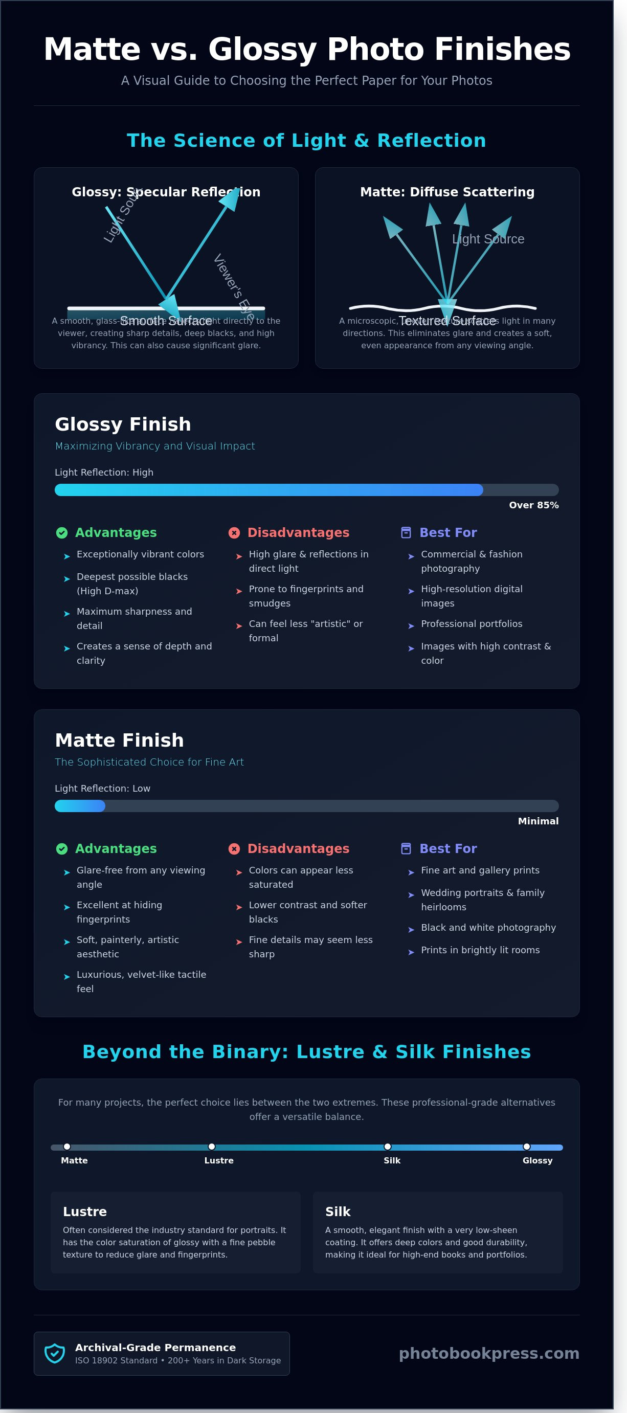
Choosing between matte vs glossy photos doesn't have to be a binary decision. Professional artisans often turn to "Press" standards to achieve a more nuanced result. These finishes bridge the gap by offering the vibrant color depth of a gloss finish with the sophisticated, glare-free properties of a matte surface. Lustre remains the definitive industry standard for professional wedding albums; it balances visual depth with a resilient surface that handles frequent viewing with grace.
While a matte finish provides a completely smooth, velvet-like appearance, lustre introduces a fine "pebble" texture. This microscopic grain breaks up light reflections, allowing the viewer to appreciate the image from any angle without distracting hotspots. It's a choice that prioritizes the physical longevity of the memory as much as the initial visual impact.
Lustre paper provides the saturation of glossy prints with the fingerprint resistance of matte. It's the primary choice for custom photobook printing because it offers a professional weight and feel. In professional photography circles, lustre is frequently cited as the most forgiving finish. Its subtle sheen enhances skin tones and highlights without the harshness of a full gloss. When viewed under gallery-style halogen lighting or soft natural light, the pebble texture creates a soft, luminous quality that brings portraits to life. It's a pragmatic choice for books intended to be shared, as the textured surface naturally repels the oils from skin that typically mar a glossy print.
Silk paper offers a high-texture alternative that provides an unmistakable heirloom feel. This finish features a unique cross-hatch texture, reminiscent of vintage photographs from the mid-20th century. It's a deliberate choice for high-end layflat photo books where the tactile experience is as vital as the visual one. Beyond its aesthetic charm, silk is exceptionally durable. The raised pattern acts as a protective barrier, effectively hiding minor surface abrasions that might occur over decades of handling.
Whether you prefer the modern versatility of lustre or the traditional elegance of silk, these professional finishes ensure your story is told with the dignity it deserves. Explore our range of premium finishes and start crafting your archival legacy today.
Selecting the right paper is the final act of the creative process. It transforms a digital file into a tactile object that carries weight and history. When you evaluate matte vs glossy photos, consider the physical environment where your work will live. A sunlit gallery or a bright living room with floor-to-ceiling windows creates significant glare on high-gloss surfaces. In these spaces, a matte finish ensures the viewer sees the image rather than their own reflection. Your choice of binding also dictates the outcome. Layflat binding allows for panoramic spreads that stay open on a table, making the subtle texture of matte paper feel like a continuous, museum-grade canvas.
The "Heirloom Test" is the ultimate benchmark for any archival project. It asks a simple question: which finish will your grandchildren appreciate most? While glossy surfaces offer immediate visual impact, they're prone to surface micro-scratches and silvering over decades. Matte and lustre finishes pass the test by resisting fingerprints and maintaining a quiet elegance that doesn't feel dated. A 2023 study of archival preservation suggests that textured, acid-free papers maintain their structural integrity longer when handled frequently, as the lack of a heavy top coating prevents the cracking often seen in aged high-gloss prints.
For bridal portraits and family chronicles, soft matte or lustre is the professional standard. These finishes handle skin tones with a delicate precision that glossy paper often misses. When you're crafting a high-end photo book, the paper must complement the cover. A matte interior provides a sophisticated contrast to a heavy leather or organic linen binding. To maintain color consistency across a 50-page spread, lustre is often the safest choice. It provides the deep blacks of a tuxedo and the bright whites of a silk gown without the color shifting that can occur under varying light sources.
Your choice should always serve the specific genre of your work. Architectural photography often benefits from the high contrast and sharp lines that a glossier finish provides, highlighting the cold precision of steel and glass. Conversely, street photography and environmental portraiture find their soul in the muted tones of a matte finish. During portfolio reviews, the tactile experience is just as vital as the visual one. A matte print invites the client to look closer, removing the barrier of reflection and creating an intimate connection between the viewer and the art. Ultimately, the best finish is the one that disappears, leaving only your story, beautifully told.
When the scope of your project extends beyond the portfolio and into the realm of large-scale commercial display, Banner 4 Sale provides the high-quality digital printing necessary for custom banners and signs, ensuring your chosen aesthetic translates perfectly to a grander stage.
Selecting the right finish is the final, essential step in honoring your creative intent. The debate of matte vs glossy photos centers on how you want your viewer to interact with the light and texture of your work. Glossy surfaces provide a vivid window into deep, saturated blacks and brilliant highlights. Conversely, matte options offer a tactile, glare-free sophistication that invites a more intimate inspection of fine art details. Since 1985, we've refined the craft of the press to ensure every choice you make is supported by archival-quality materials that stand the test of time.
Our state-of-the-art Maryland-based printing facility employs the same meticulous standards preferred by professional photographers worldwide. We treat every image as a precious artifact, merging technical precision with the emotional resonance of your unique story. Whether you choose the high-contrast drama of a gloss or the understated elegance of a silk finish, your decision defines the lasting legacy of your work. Explore our curated selection of professional finishes at PhotoBook Press to begin the next chapter of your creative journey. Your story deserves to be beautifully told with the quiet confidence of true artisan quality.
Matte finishes are the superior choice for framing behind glass because they don't have the reflective coating that causes photos to stick to the glazing. When glossy prints touch glass, they often create Newton rings, which are oily looking interference patterns that distort the image. Using a matte finish or a 2 mm acid free mat board ensures a necessary air gap, preserving your heirloom quality prints for decades.
Matte finishes provide much better durability for photo books intended for frequent handling. The high shine of glossy paper acts like a mirror for natural skin oils, leaving visible fingerprints after just one viewing. For an archival quality experience, a matte or lustre finish resists these smudges, ensuring the pages remain pristine even after 100 turns. This tactile resilience is essential for preserving your family legacy.
Neither finish inherently fades faster, as longevity depends on the chemical stability of the inks and the paper's acid content. However, matte prints often appear to age more gracefully because they don't have a plastic like top layer that can yellow or crack over 25 years. To ensure your matte vs glossy photos stand the test of time, look for prints rated for 100 years of lightfastness under ISO 18902 standards.
You can mix finishes within a single photo book, though most artisans advise against it to maintain a cohesive visual narrative. Switching between textures can disrupt the viewer's immersion, as the eye must constantly adjust to different light reflections. If you choose to experiment, limit the variation to 2 distinct sections to ensure the transition feels like a deliberate design choice rather than a production error.
Professional photographers prefer lustre because it offers the deep color saturation of glossy paper without the distracting glare. This pebbled texture provides a sophisticated balance, hiding minor surface scratches that occur during the binding process. Lustre prints are a staple in 90 percent of wedding albums because they maintain skin tone accuracy across varied lighting conditions, creating a timeless, gallery quality aesthetic.
Glossy finishes tend to enhance the perceived sharpness of an image by increasing the contrast between light and dark areas. The smooth surface allows light to reflect directly back to your eye, making fine details in a 300 DPI print appear more defined. While matte finishes offer a soft, painterly quality, glossy paper is the standard choice when you want every microscopic detail of a landscape to pop.
Using glossy paper for high contrast black and white projects results in exceptionally deep blacks, known in the industry as a high Dmax value. Glossy coatings can achieve black density levels around 2.4, whereas matte papers often peak at 1.6. This creates a striking, dramatic effect that highlights the silver halide aesthetic of traditional film photography, making it perfect for bold, architectural imagery.
Your home's lighting is a critical factor when deciding between matte vs glossy photos for wall art. If your room has 3 or more windows or uses overhead halogen bulbs, a glossy print will produce harsh reflections that obscure the image. Matte finishes are the professional choice for sunlit spaces, as they diffuse light across the surface. This ensures your art remains visible from every angle in the room.
